Rush University Medical Center
Chicago, IL
Rush Rubschlager Ambulatory Building
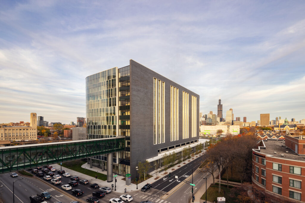
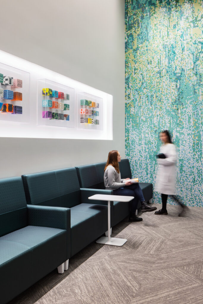
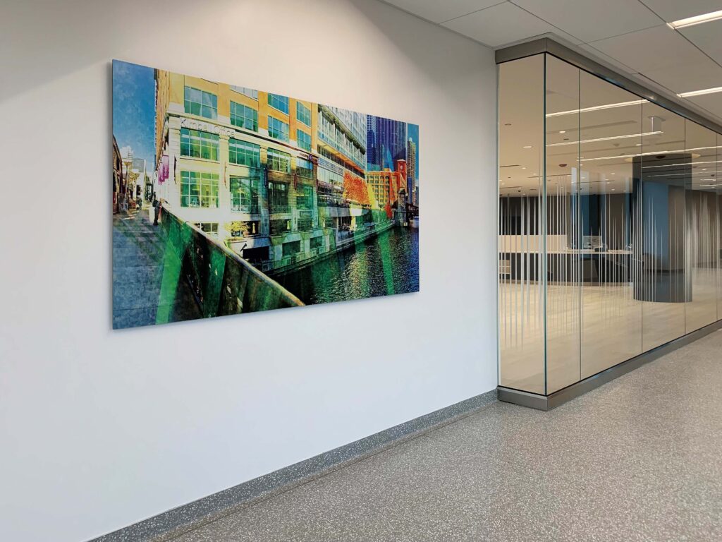
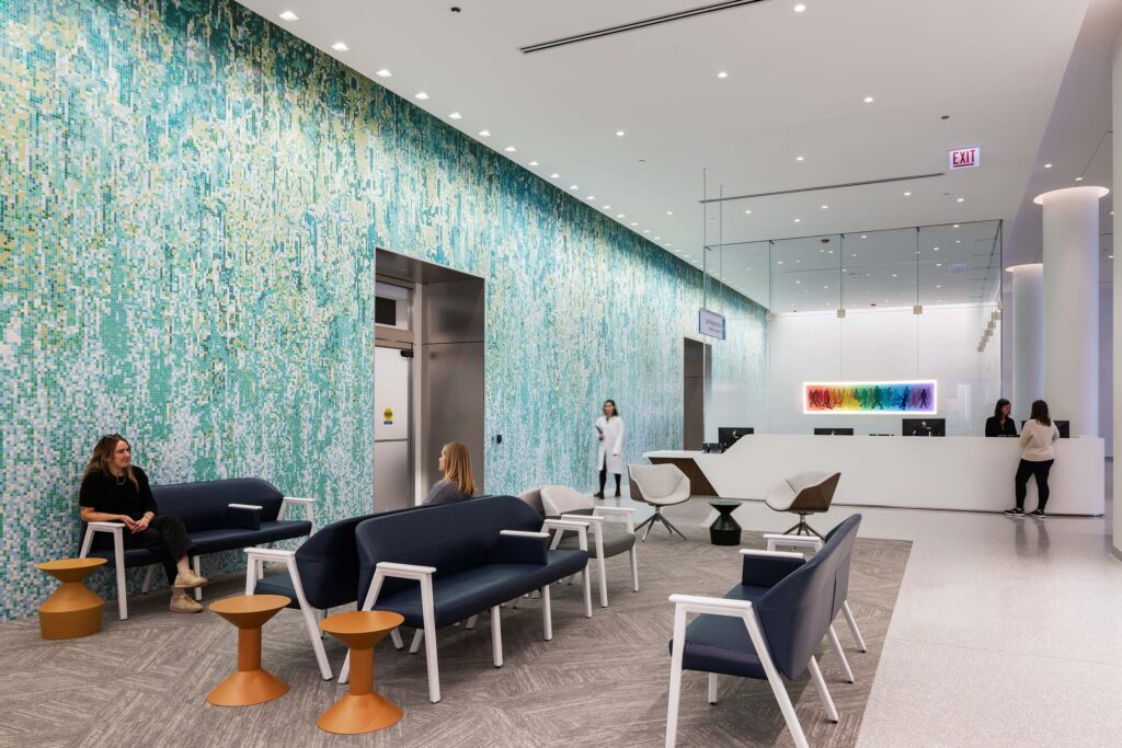
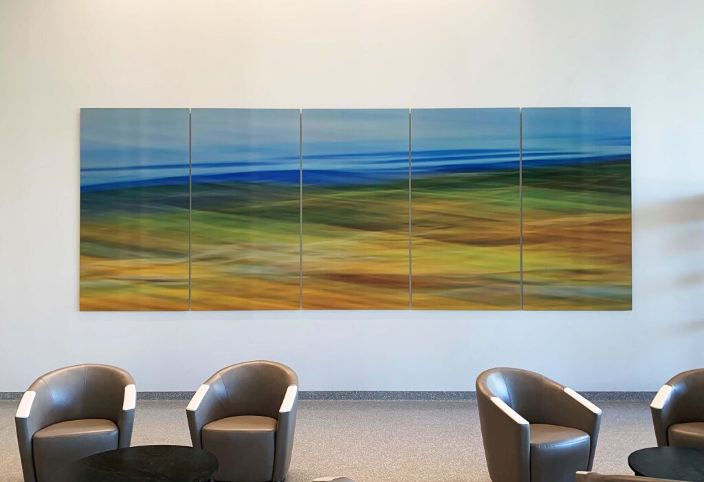
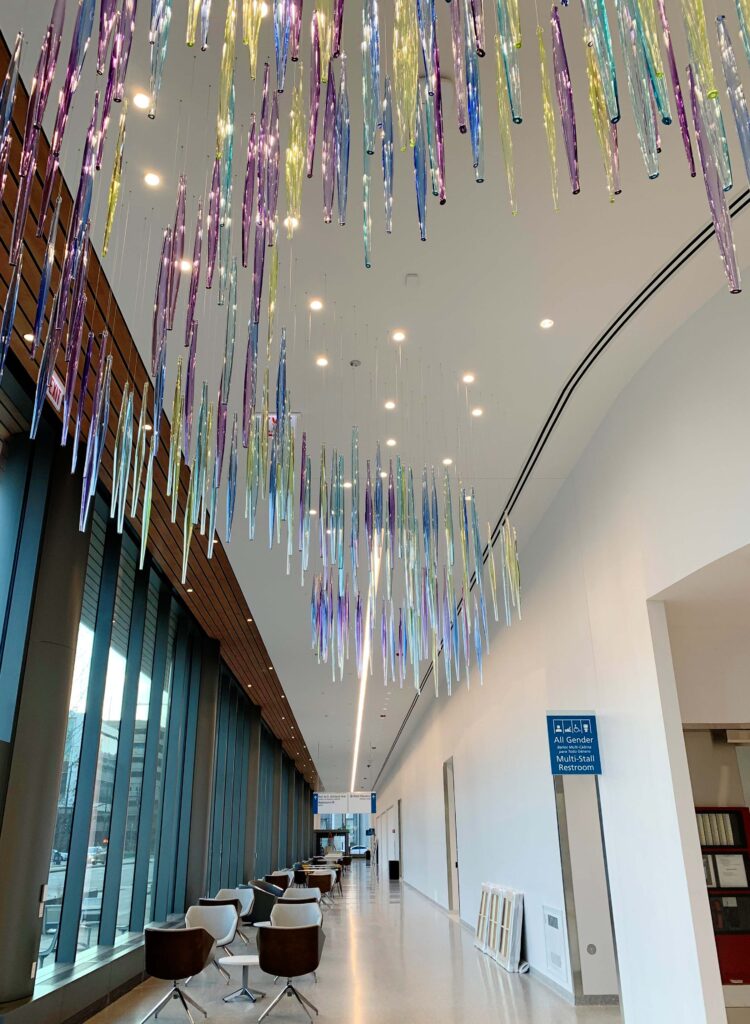
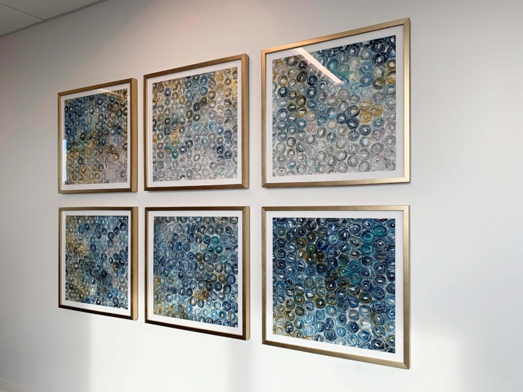
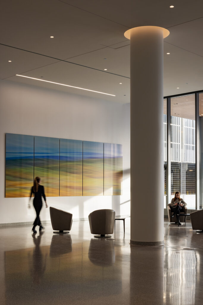
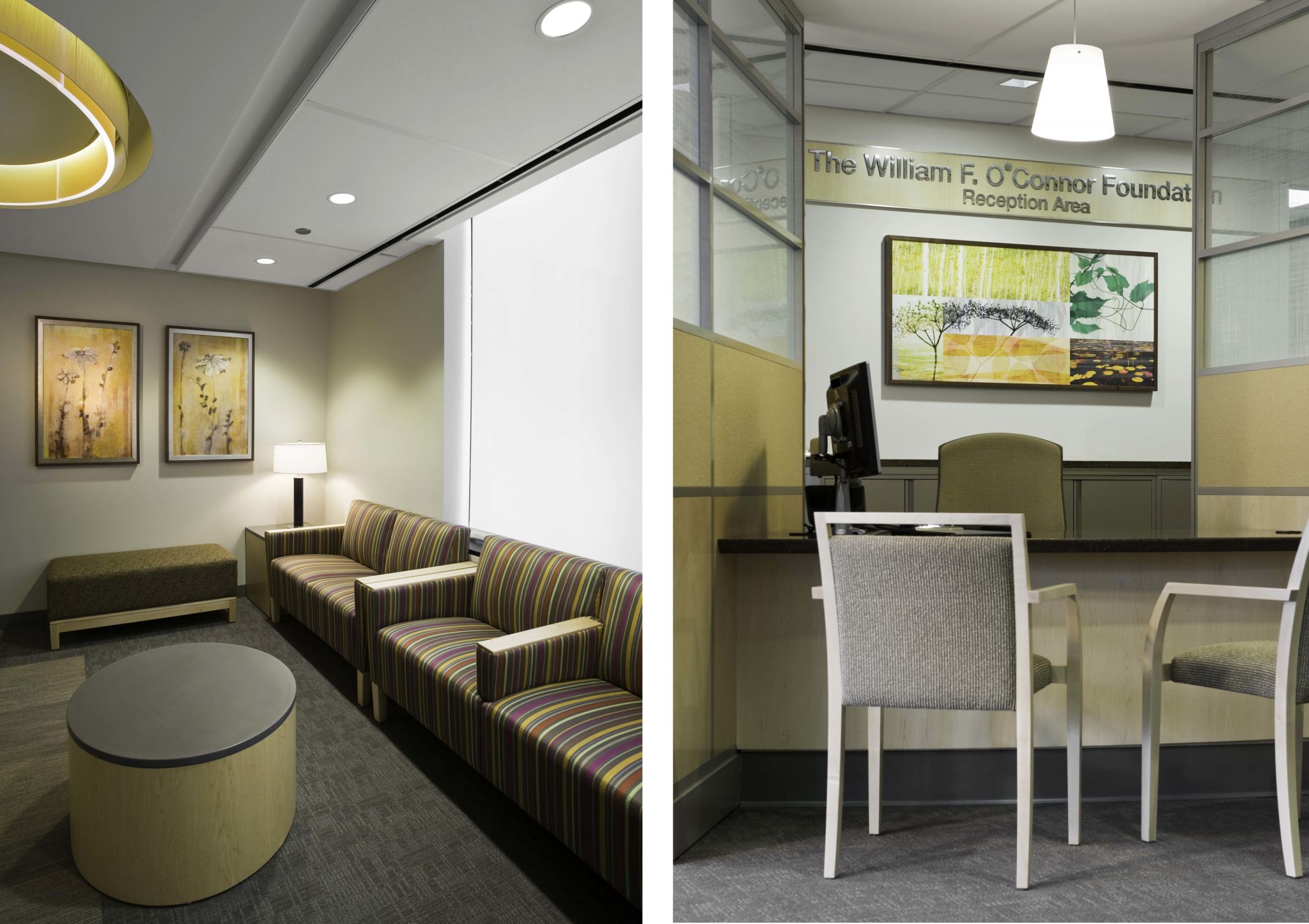
H. Marion curated a healing art program for Rush’s new ambulatory building: the Joan and Paul Rubschlager Building. A destination for cancer, with a wide variety of services and enhanced features to elevate your health care experience. Our designers developed a local artist program to create a patient and family centered healing environment for all families and staff who utilize this space. While there is a thread of continuity to the art we installed on these 10 levels, art was tailored to match the unique modality in each area. Art was carefully selected to promote the Rush mission including many pieces that were custom branded to Rush. We’re proud to be part of “The Rush Family.”
East Patient Tower
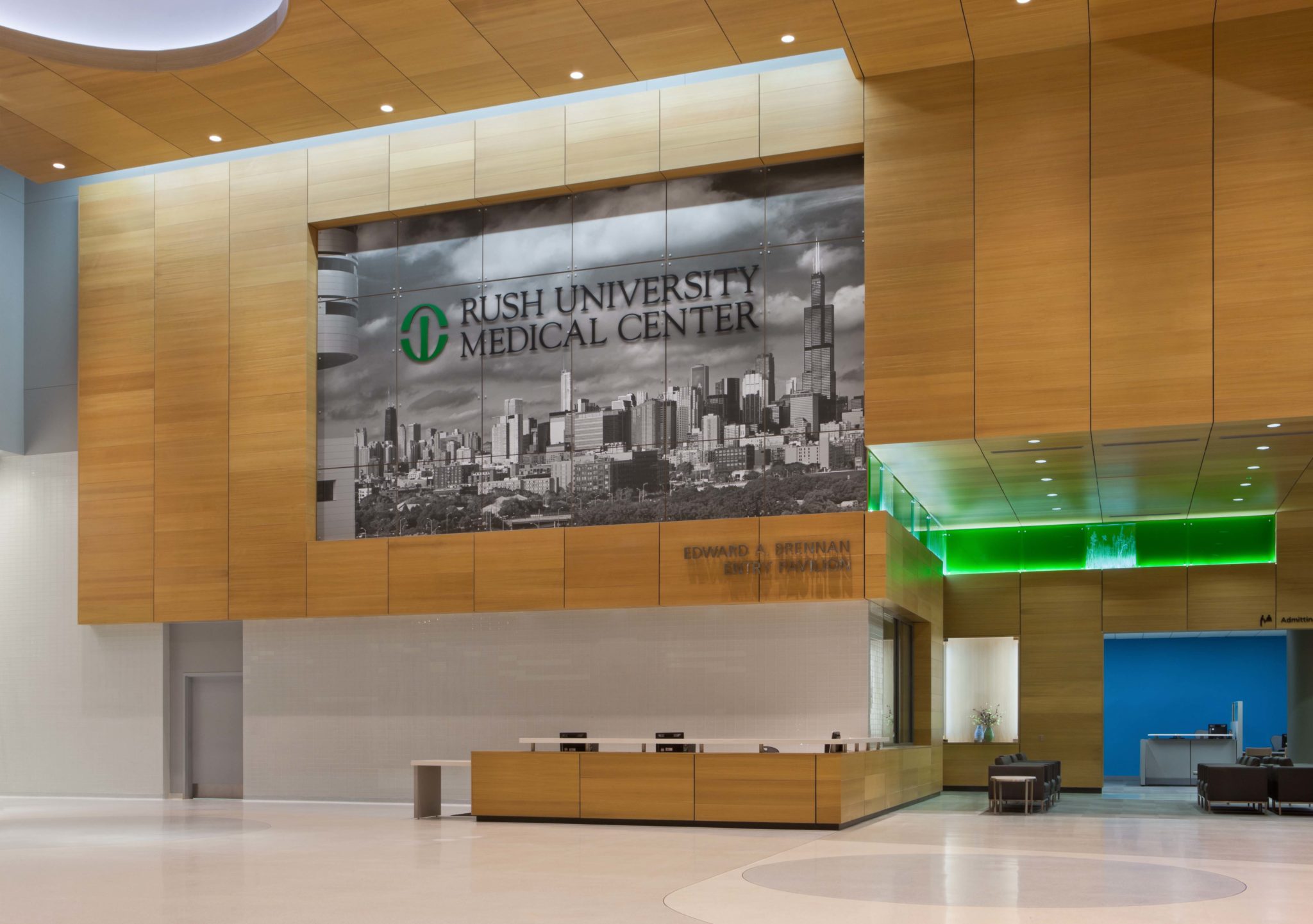
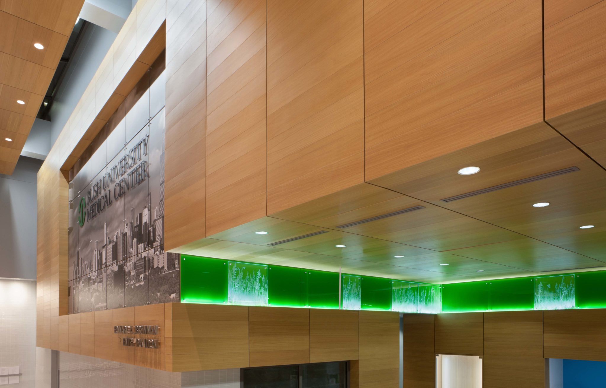
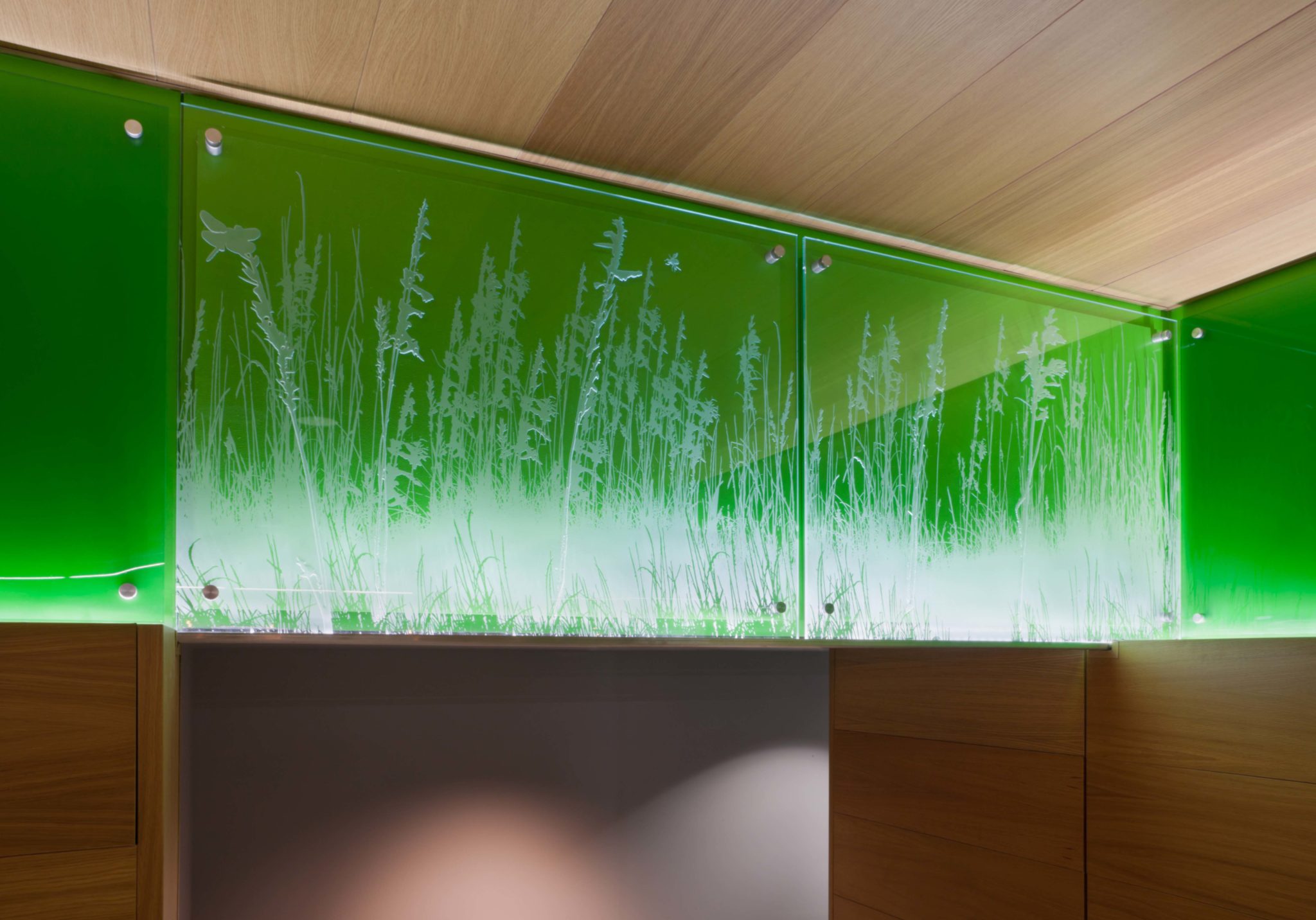
It was important that our artwork represented the hospital’s brand. Upon entering the Brennan Pavilion, the new front door to the hospital, we used a 20’x30′ mural of the Chicago skyline, taken from the vantage point of the hospital itself, printed on lightweight aluminum faced dibond panels. This large scale graphic showcases Rush as “the city hospital.” Next to the urban portrait are a series of glass panels in the hospital’s branded green, intermixed with hand carved glass panels depicting blowing prairie grass. This organic imagery further ties this installation to its Midwestern roots.
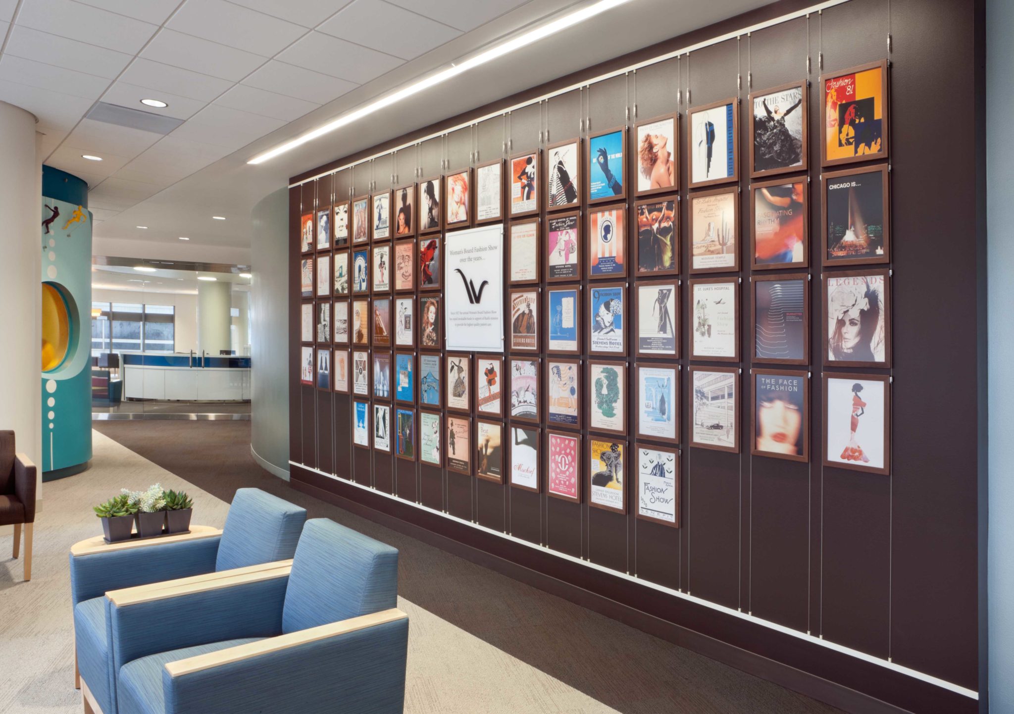
We worked with the hospital archives to pay homage to Rush’s rich 180-year history: in existence longer than any other healthcare institution in the city, it received its charter two days before the City of Chicago itself was incorporated. From this research, we created an engrossing installation of posters advertising the Women’s Board Fashion Show from its inception in the 1920’s. Installed using a contemporary track and cable system that not only has an architectural feel, but is also adjustable, allowing for the addition of new posters on an annual basis.
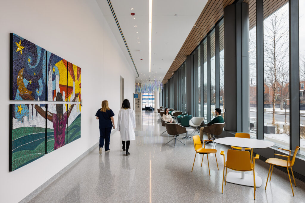
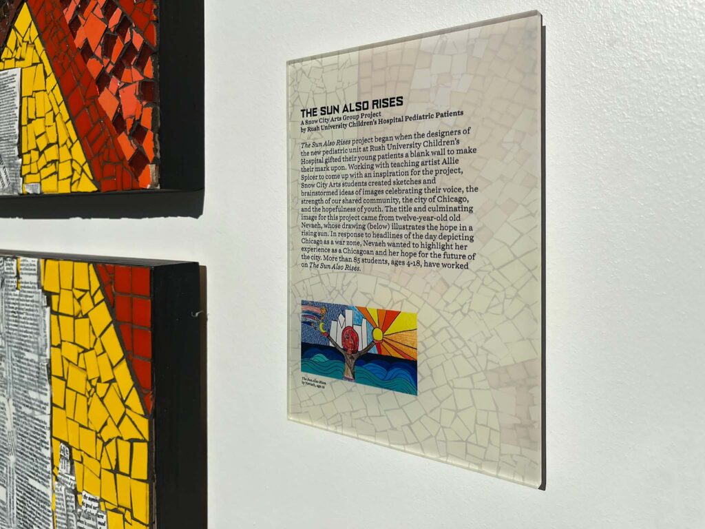
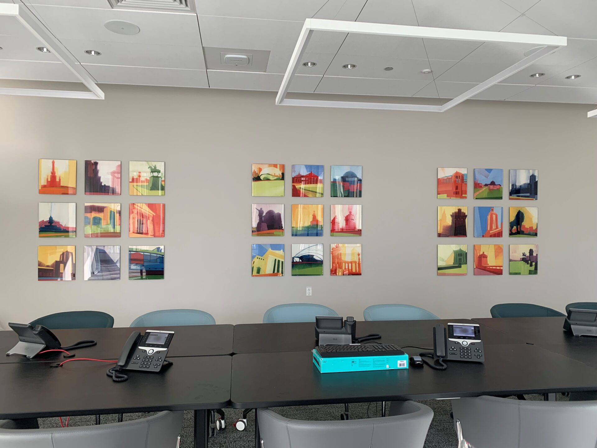
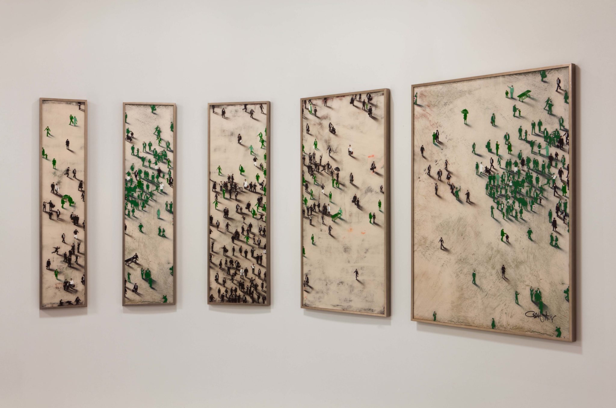
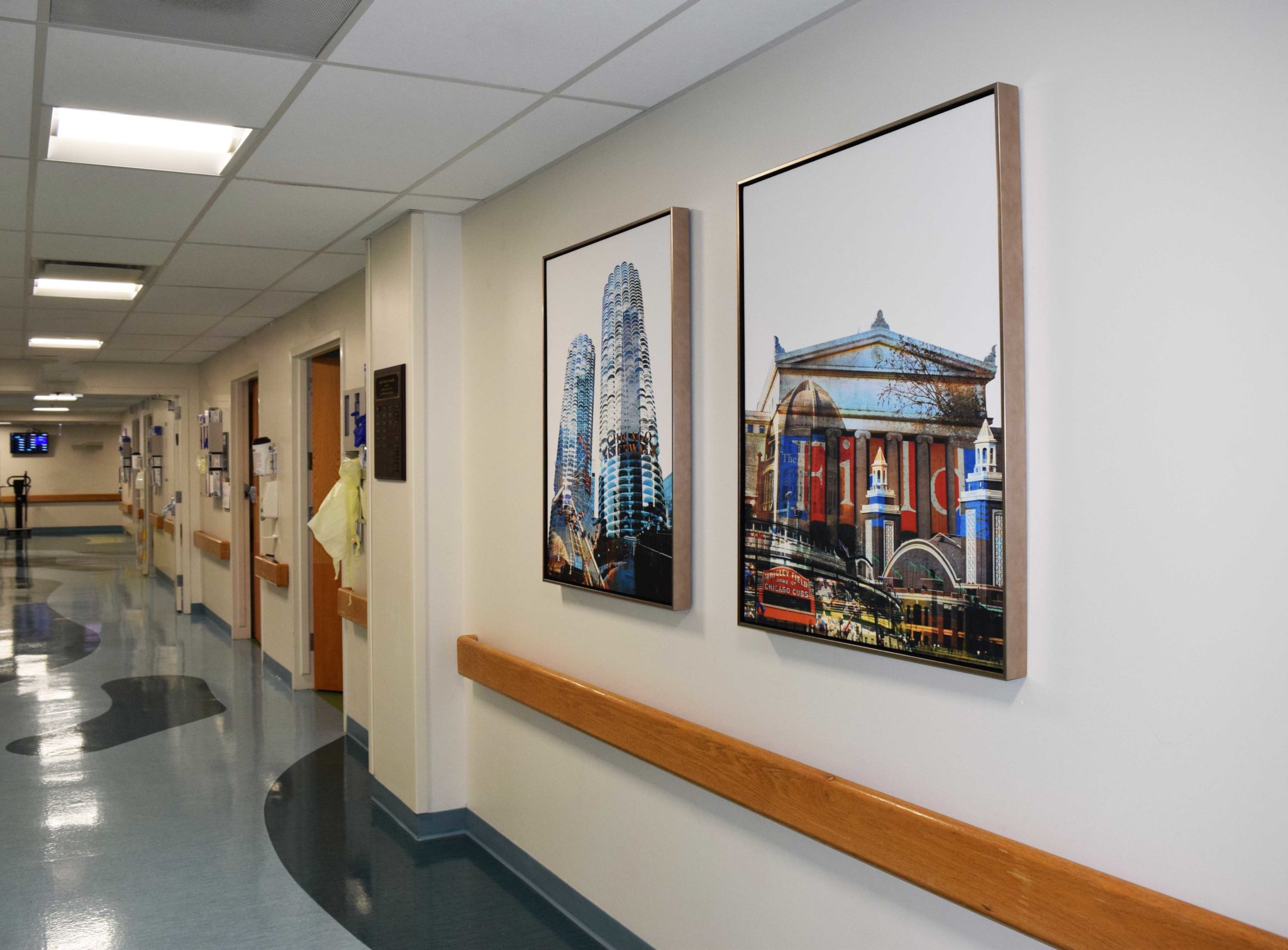
We wanted to use Chicago artists and scenes to reflect that we are part of the fabric of the city. An artist will usually paint what they know, and by virtue of that, their art will reflect the personality of a region, making the building more accessible to its visitors. This approach aligns perfectly with the client’s commitment to diversity, making inclusiveness a priority in every way, right down to the artists’ works hanging on the walls.
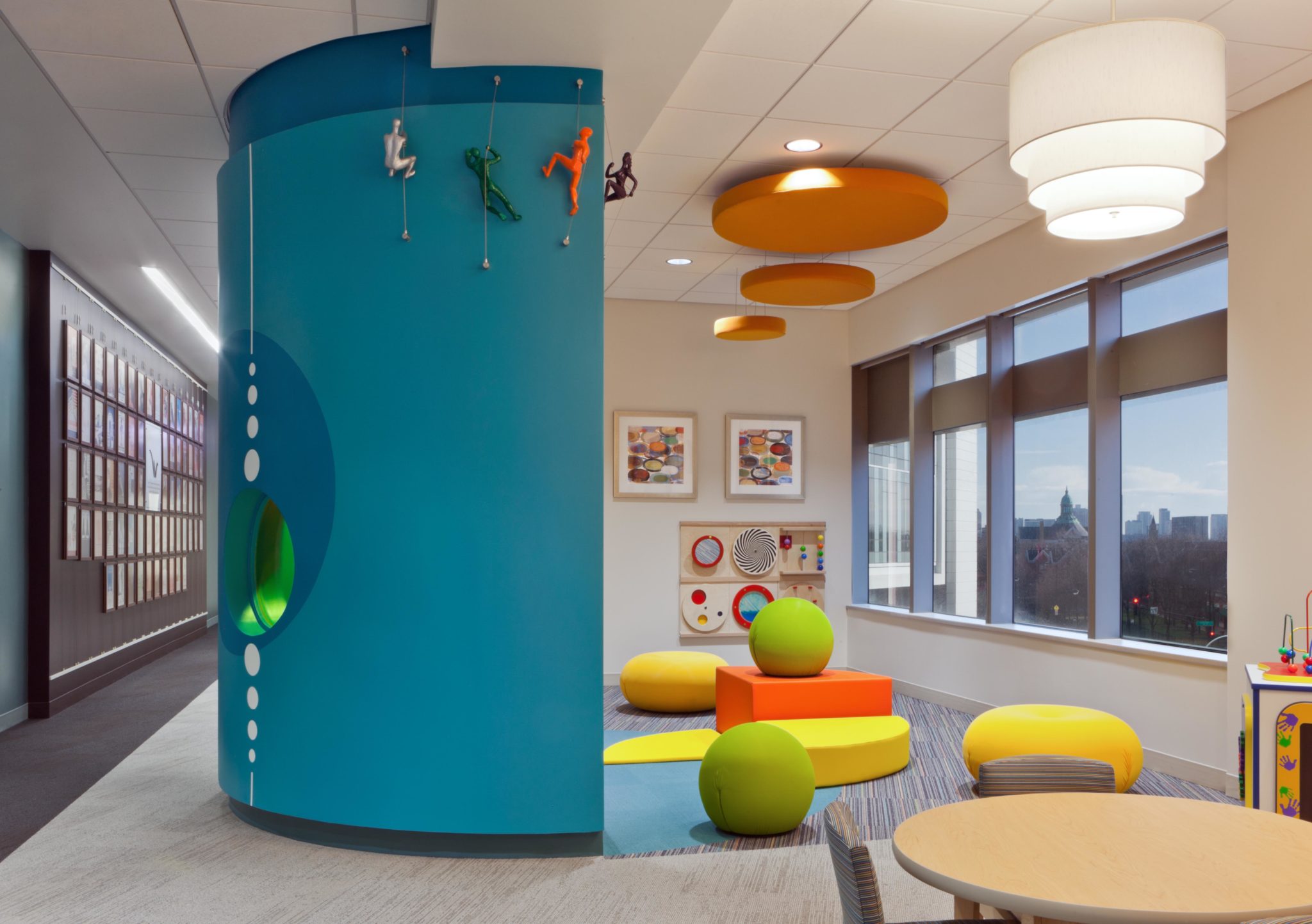
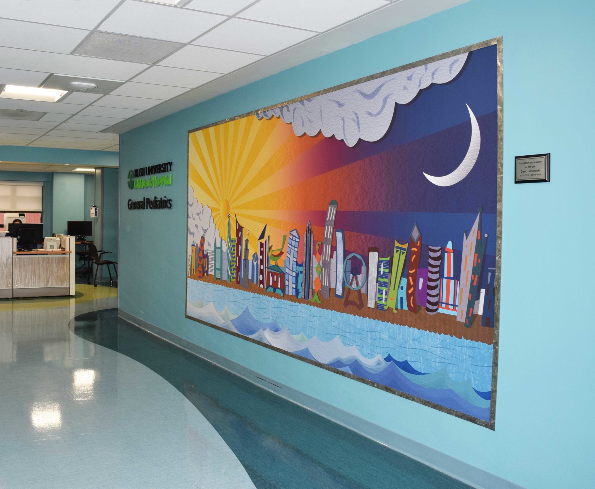
Special consideration was given to the family lounge areas of each floor, where patients and visitors gather to relax together. The pediatric lounge is themed to this particular population, which includes brightly-colored children’s art and sculptures on the walls of figures climbing ropes. All the art in this section of the hospital is bright and whimsical.
Rush Student Study Hall
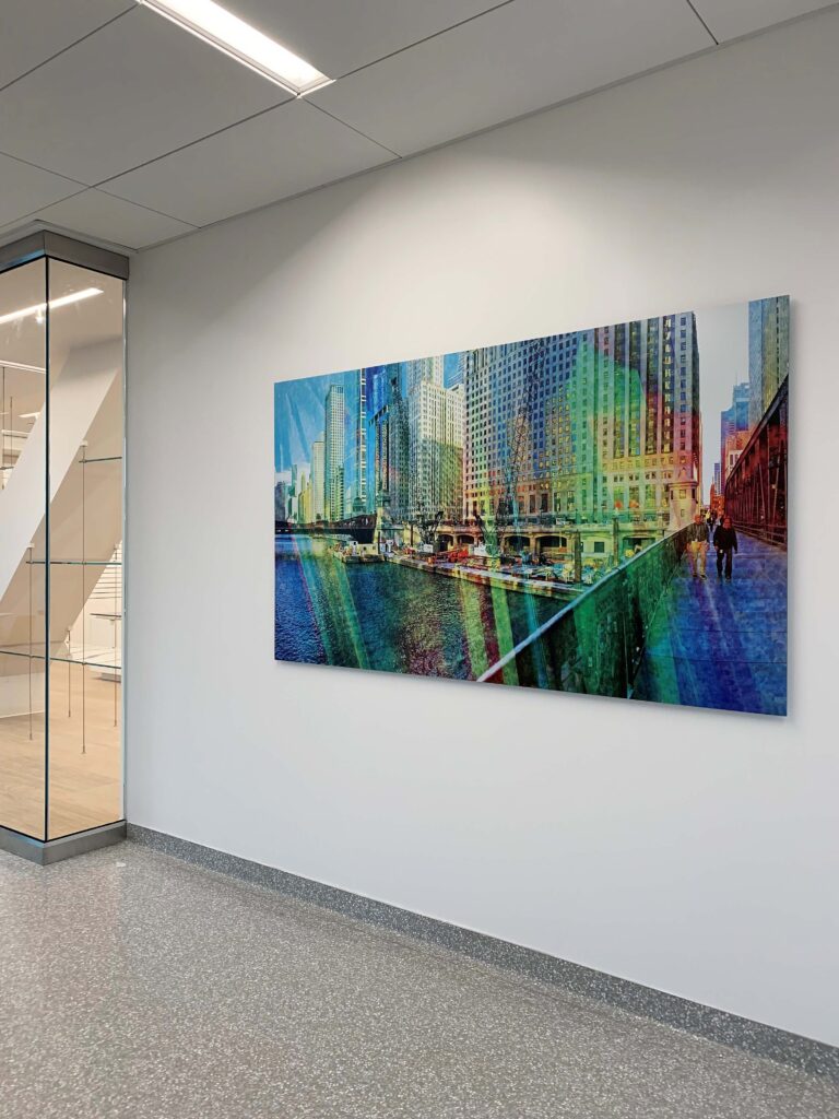
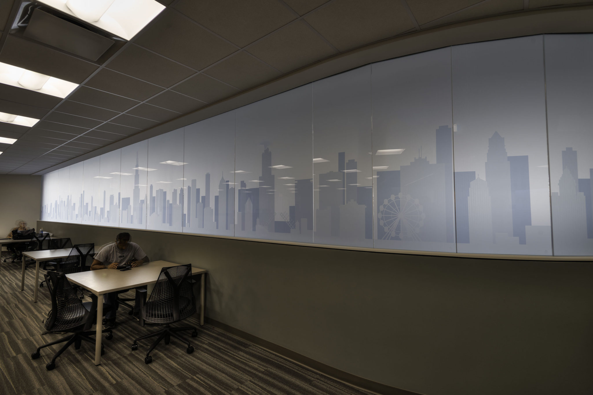
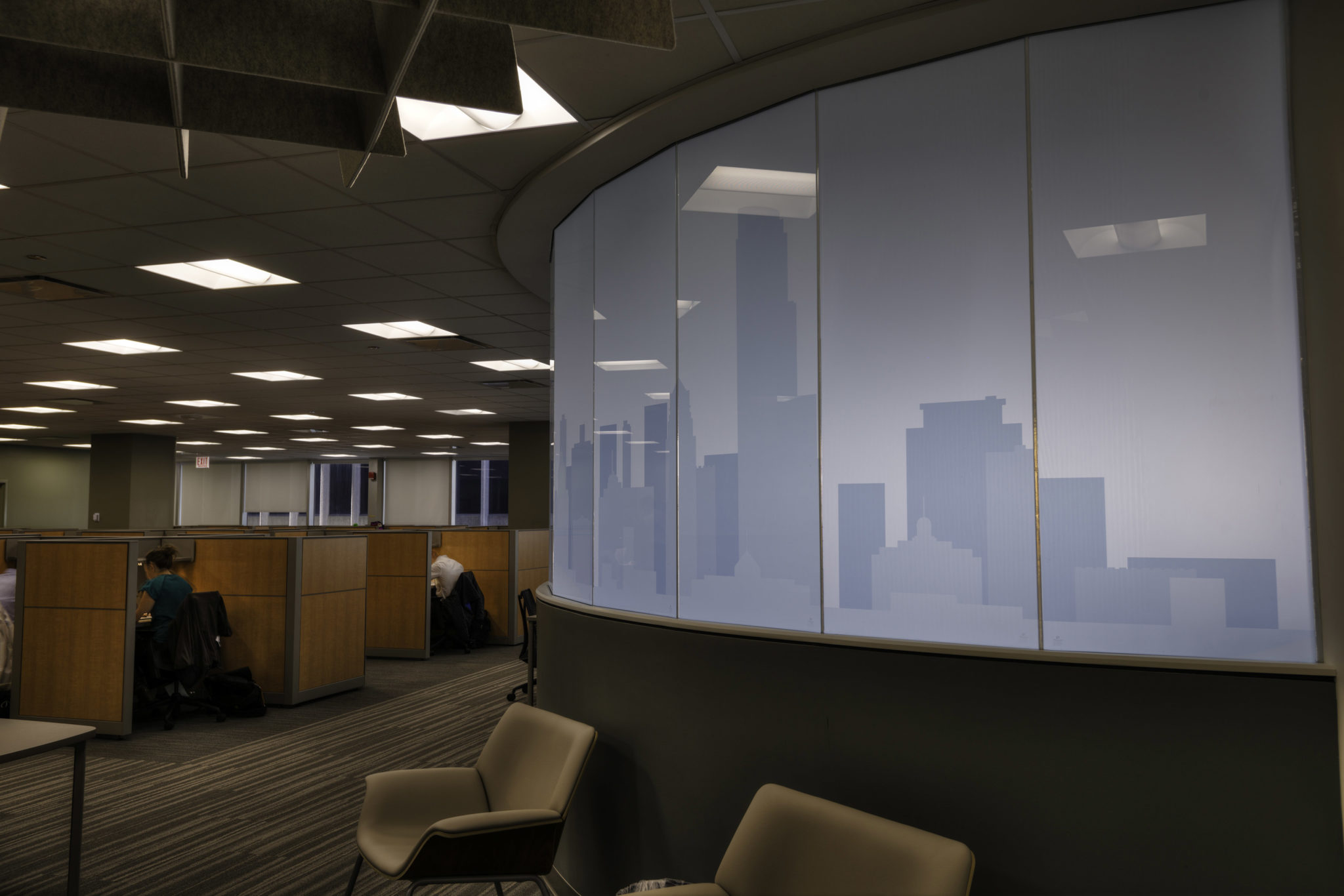
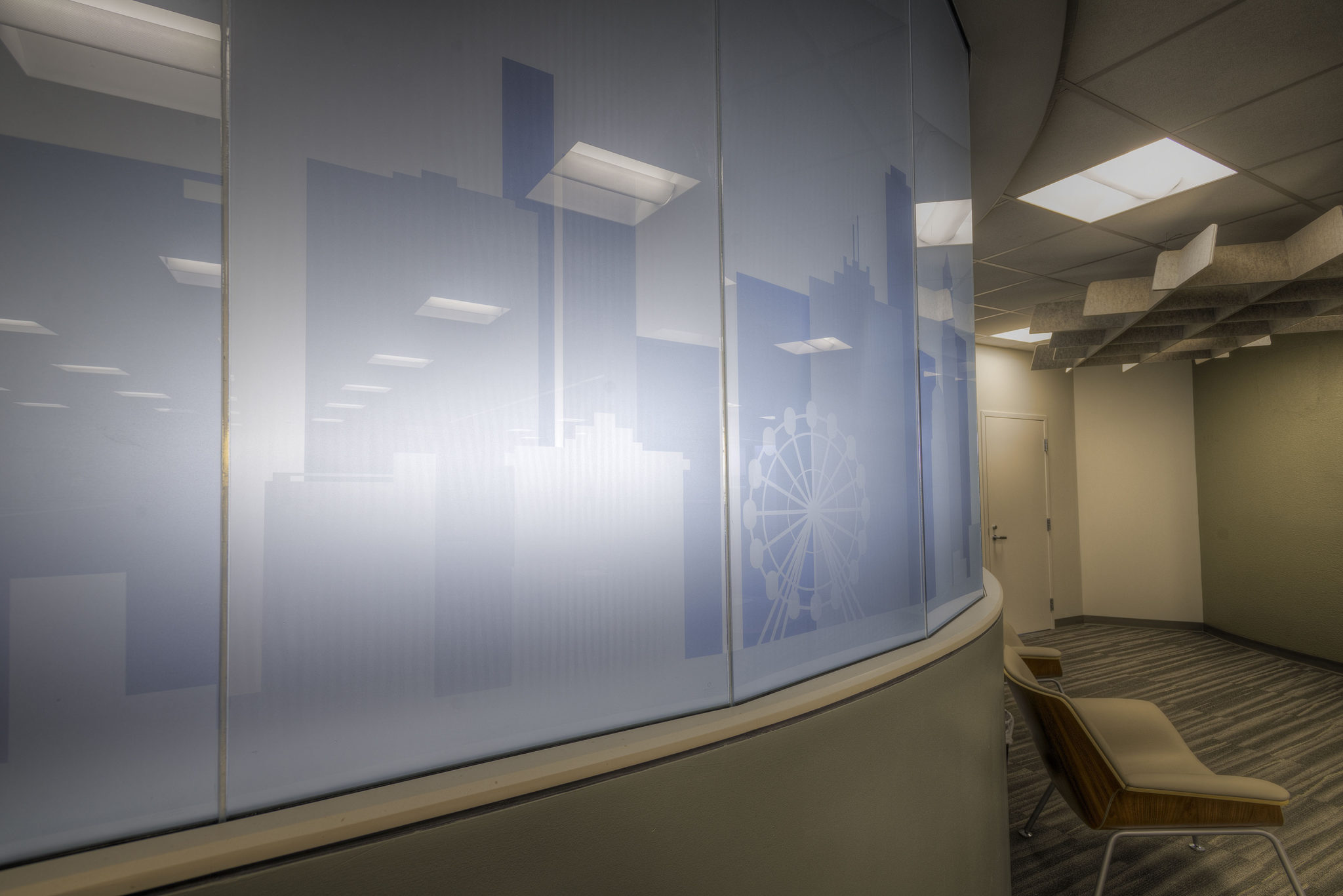
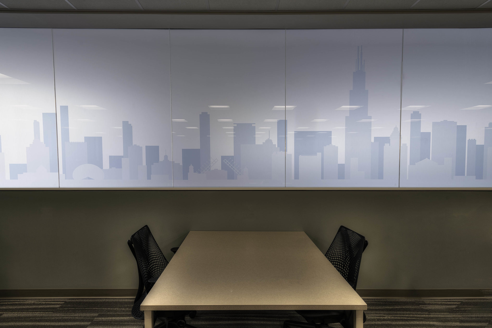
Our graphic designers created this architectural cityscape which was then printed on translucent film and applied to existing glass. Although the viewing side of the glass is at eye level, our installation happened on the backside of the glass, which required extensive scaffolding in an adjacent stairwell, to insure durability. We gave the client a durable product and imagery which establishes a sense of place and a youthful motif appealing to the student population.
Rush Outpatient Cancer Center
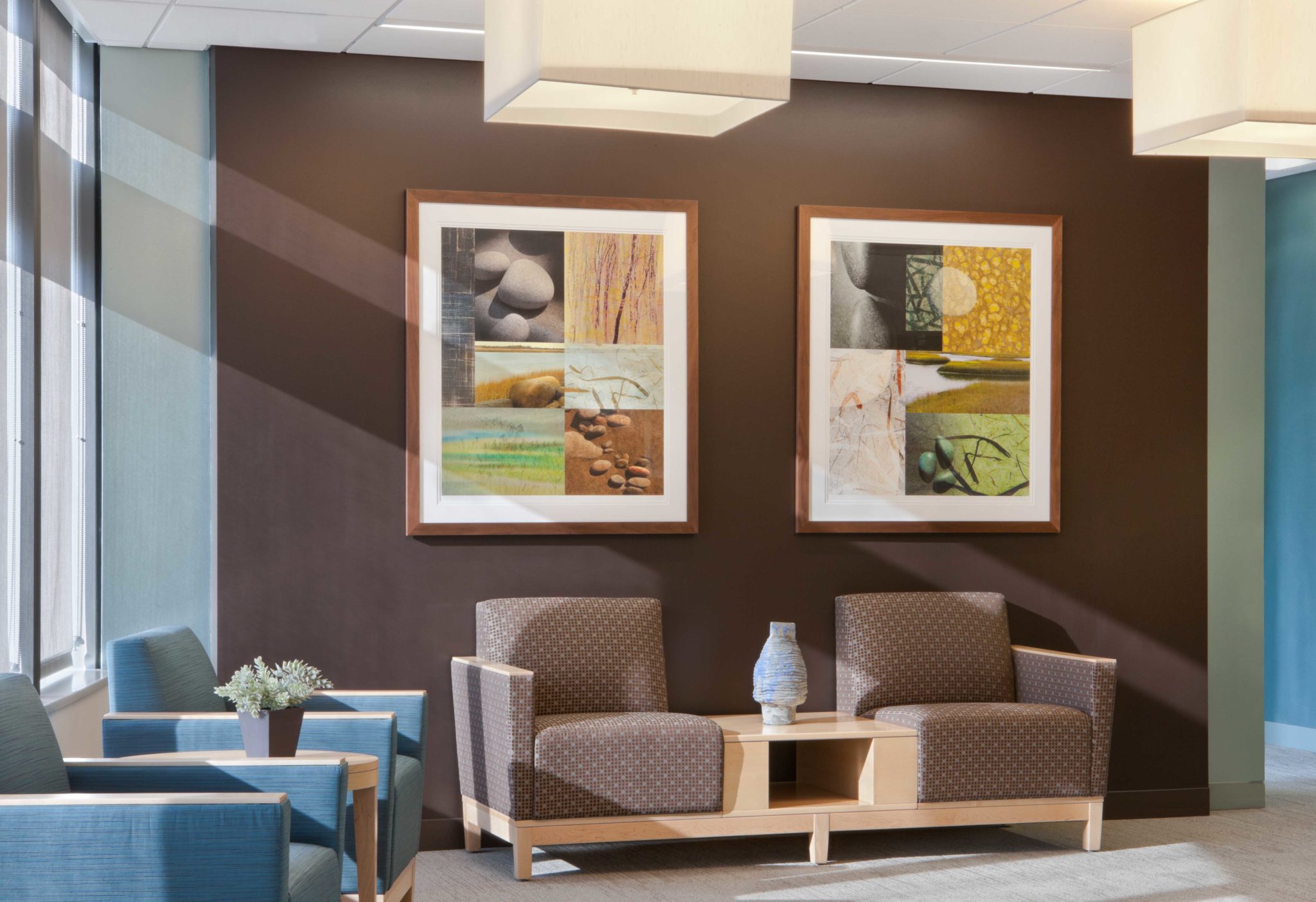
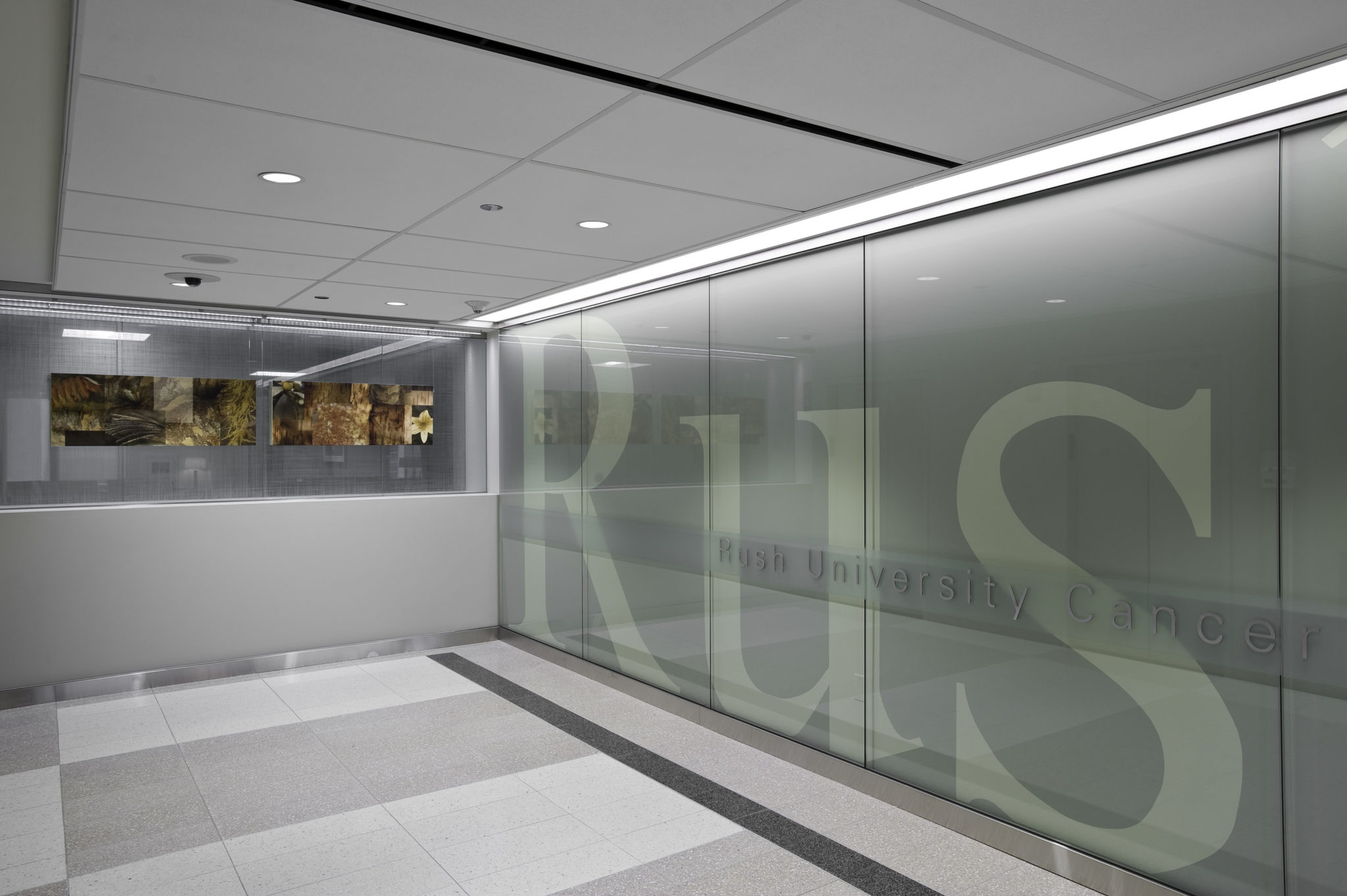
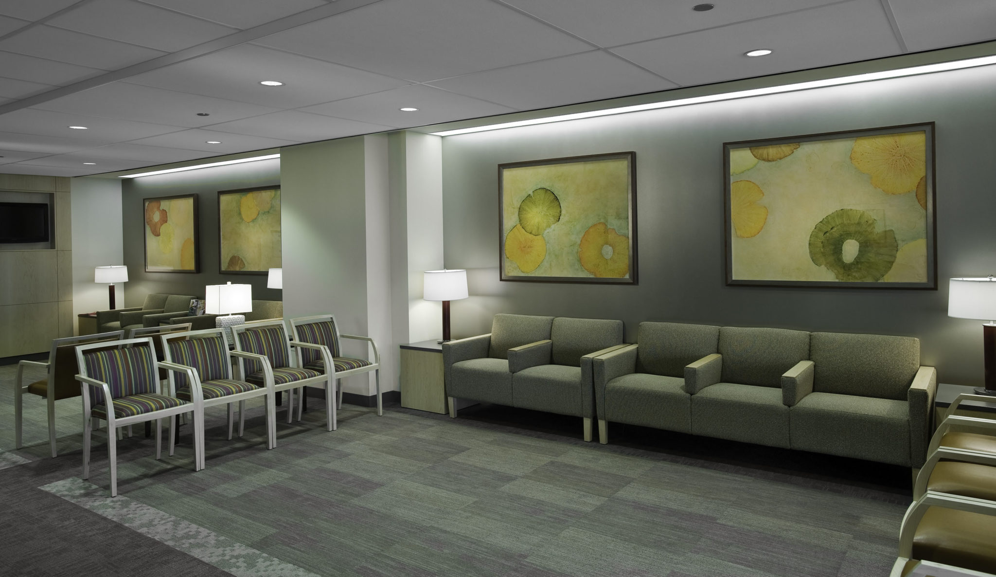
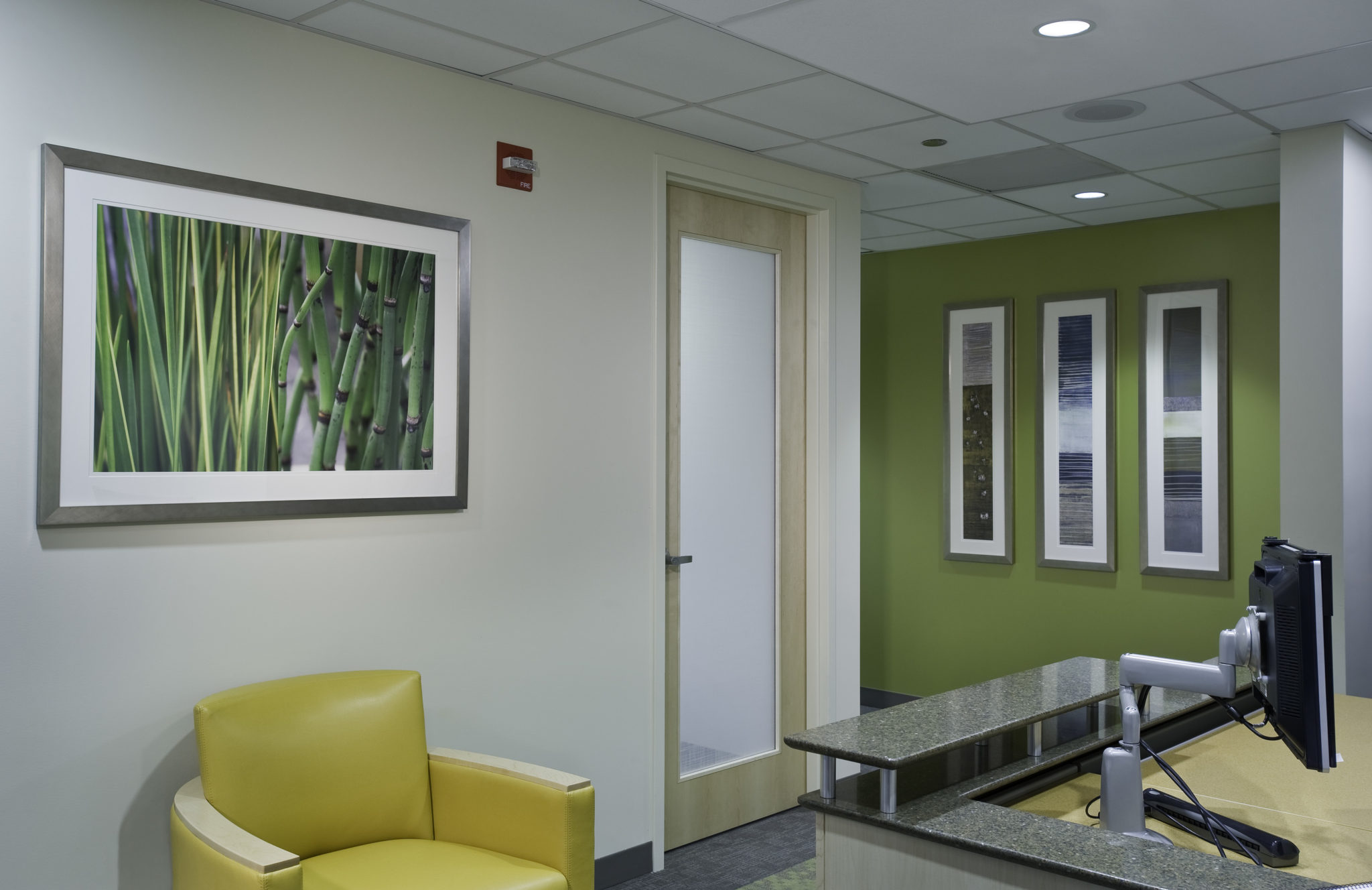
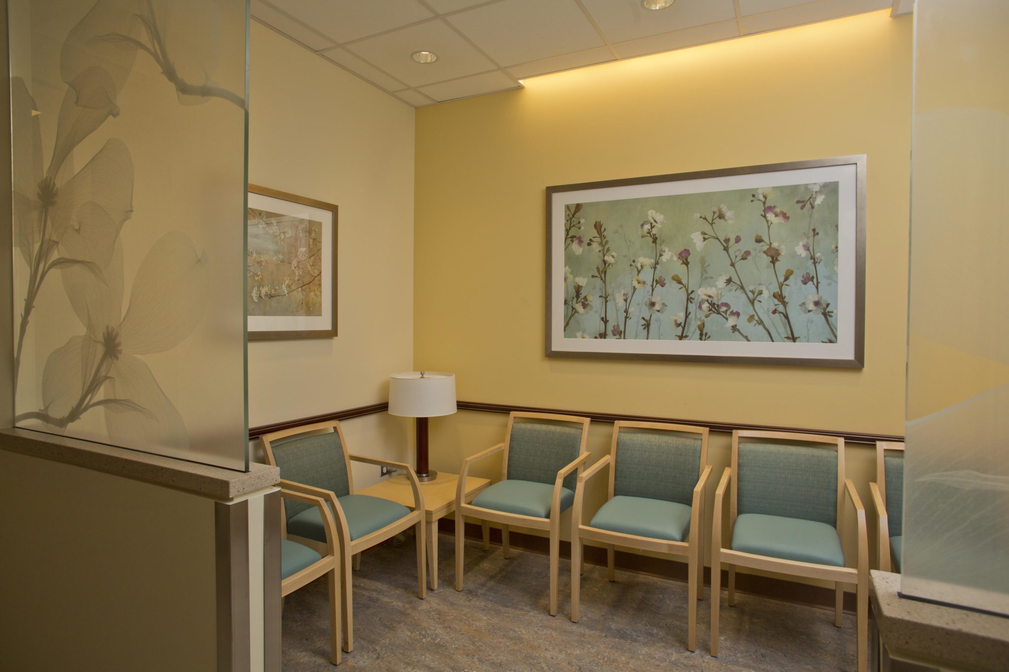
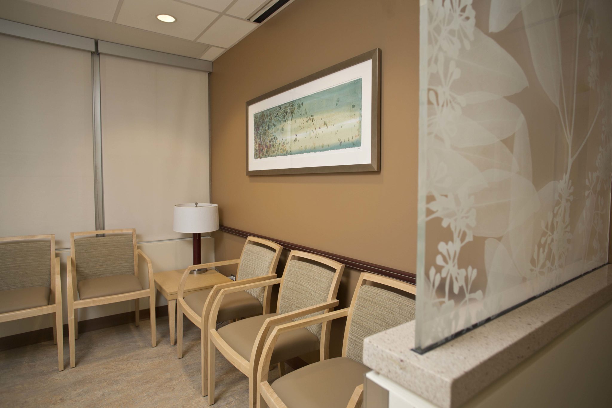
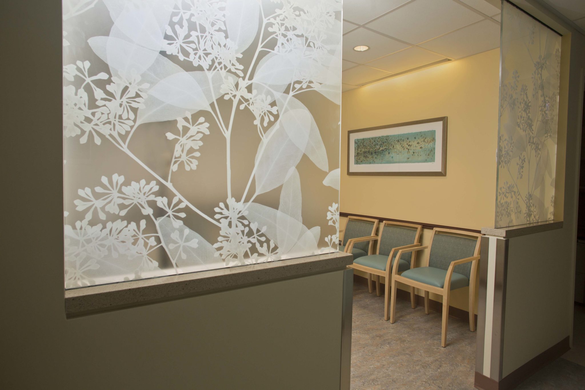
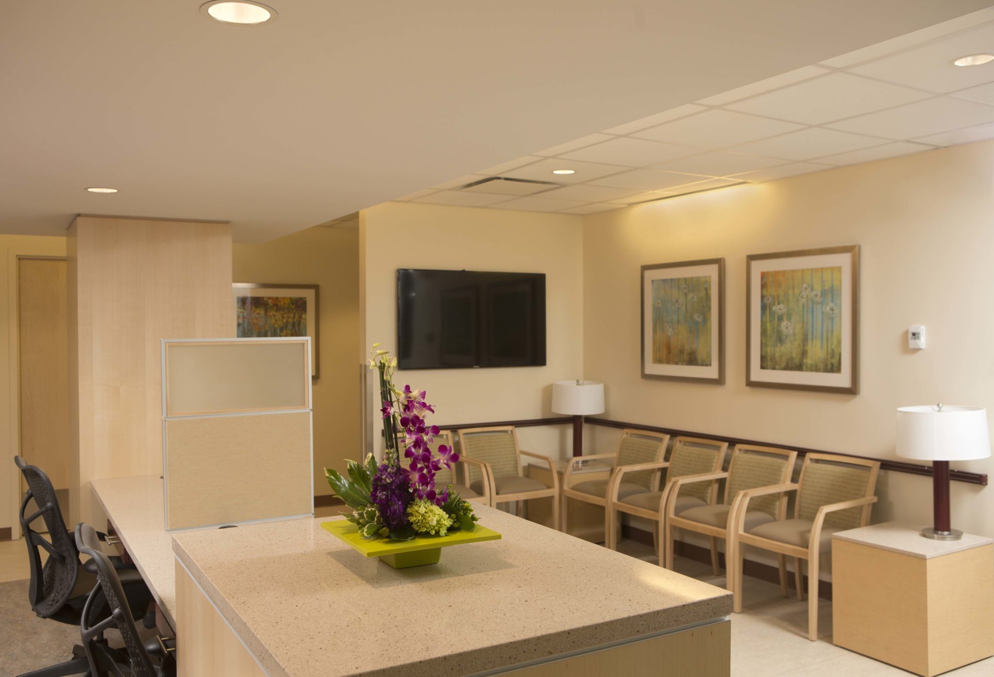
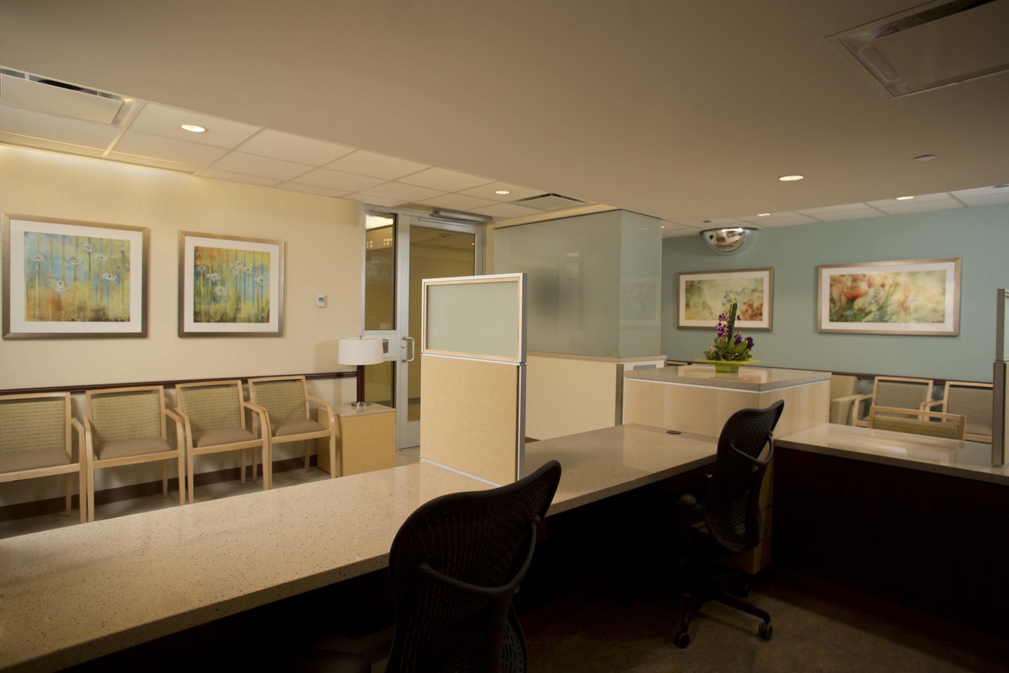
The outpatient cancer center which opened in 2011 is a vital part of the 10-year Rush Transformation. The art program we delivered created a soothing environment that is a physical manifestation of the tenets of the transformation: “Design a comfortable environment to support Rush core values” and “Embrace the community through design.” We utilized spa-like natural elements to create the effect of bringing nature inside, while also highlighting a rich colorful palette which showcased Chicago’s rich diversity and neighborhood culture. As art consultant for the Rush Transformation, we are responsible for establishing the art vision of Rush’s governing board and reinforce the Rush brand image.
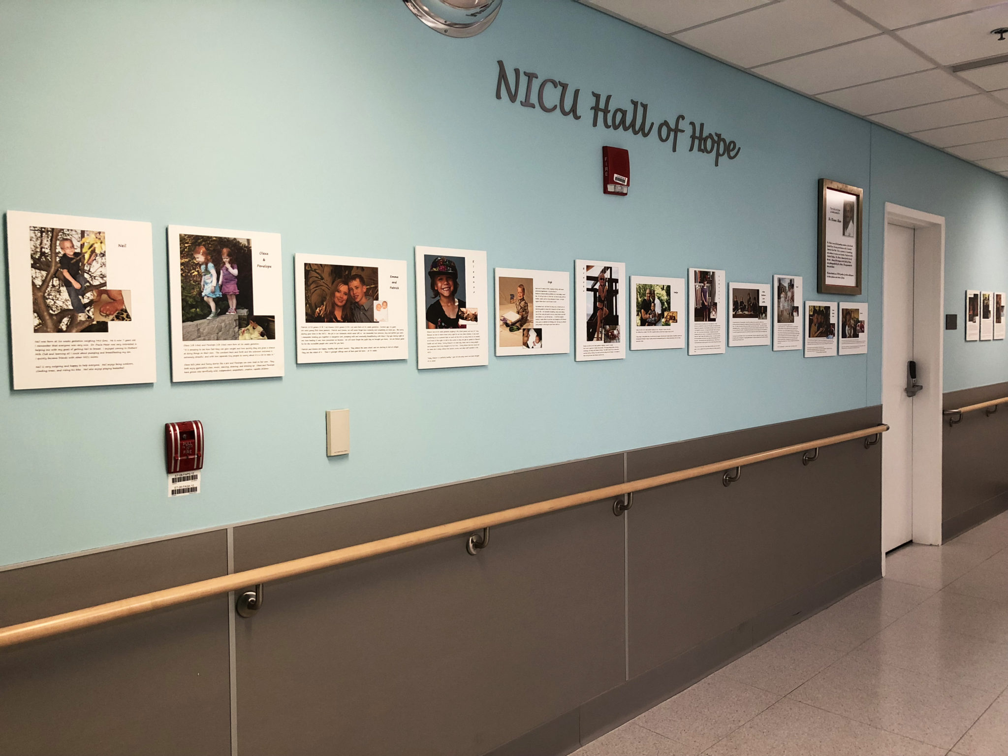
Rush PICU/NICU
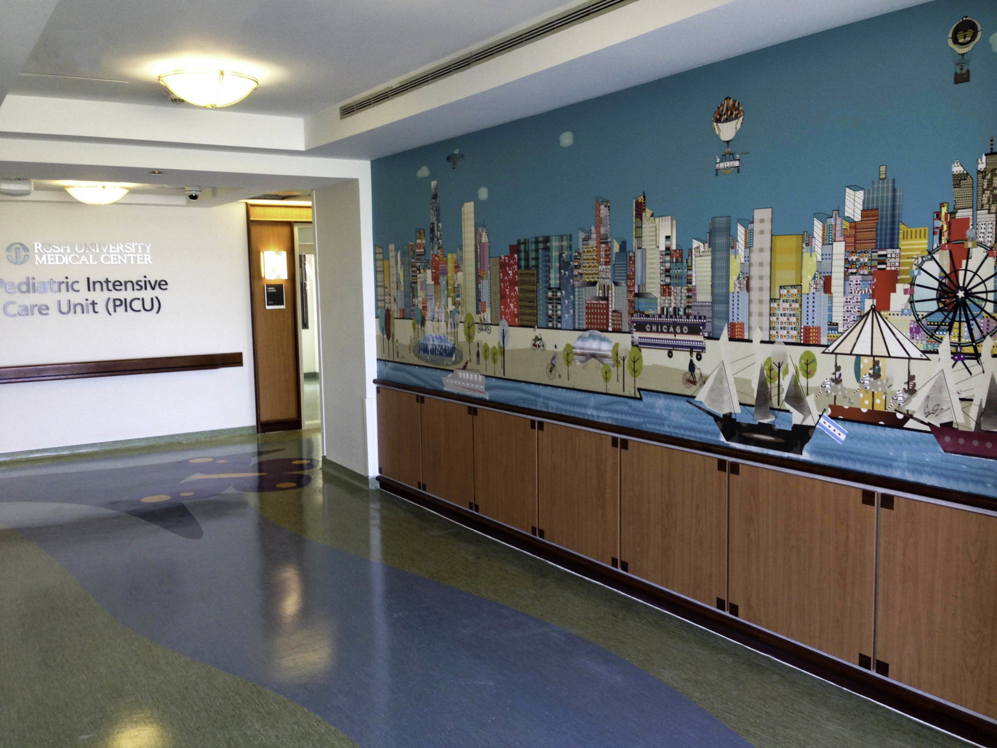
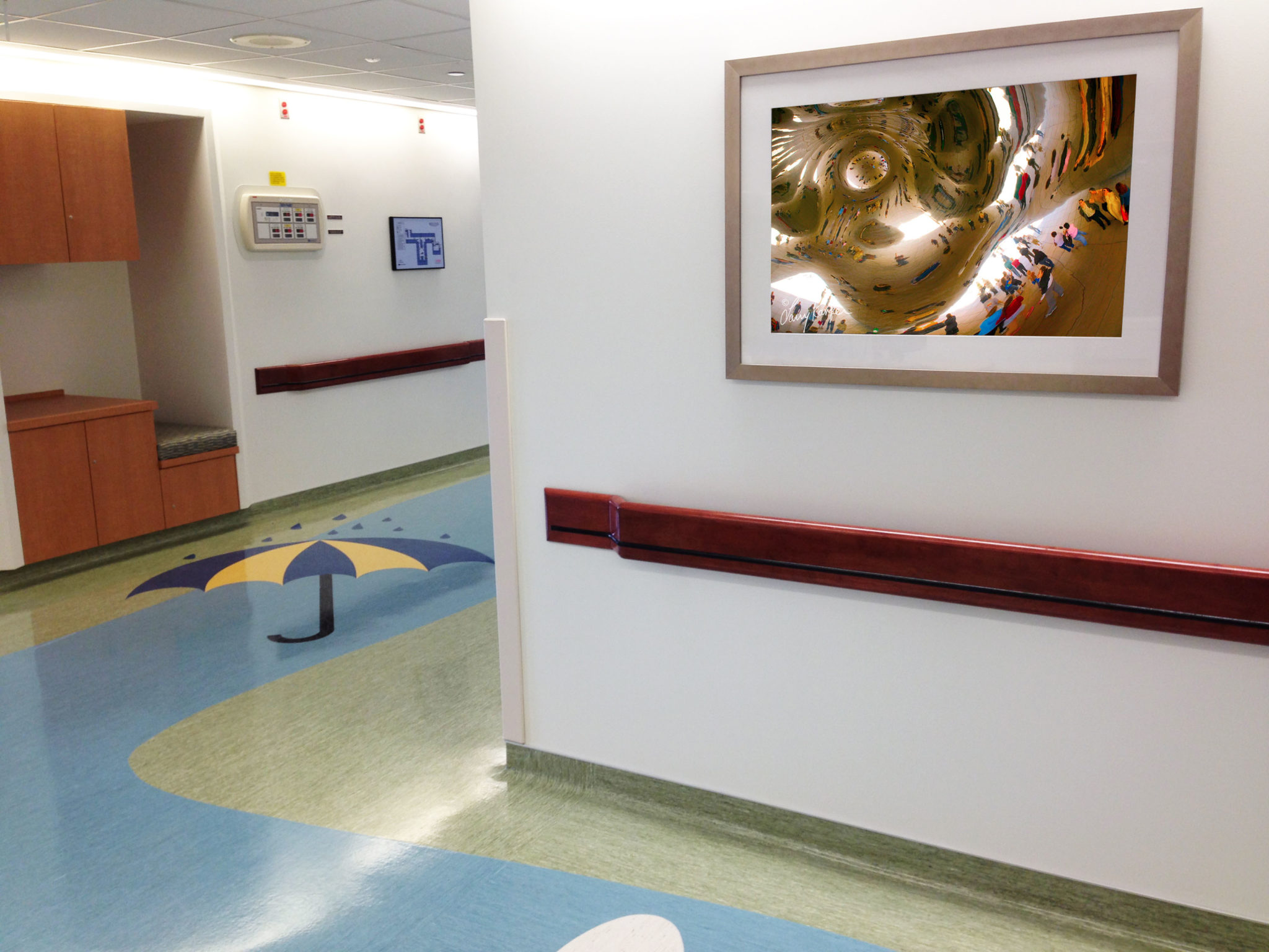
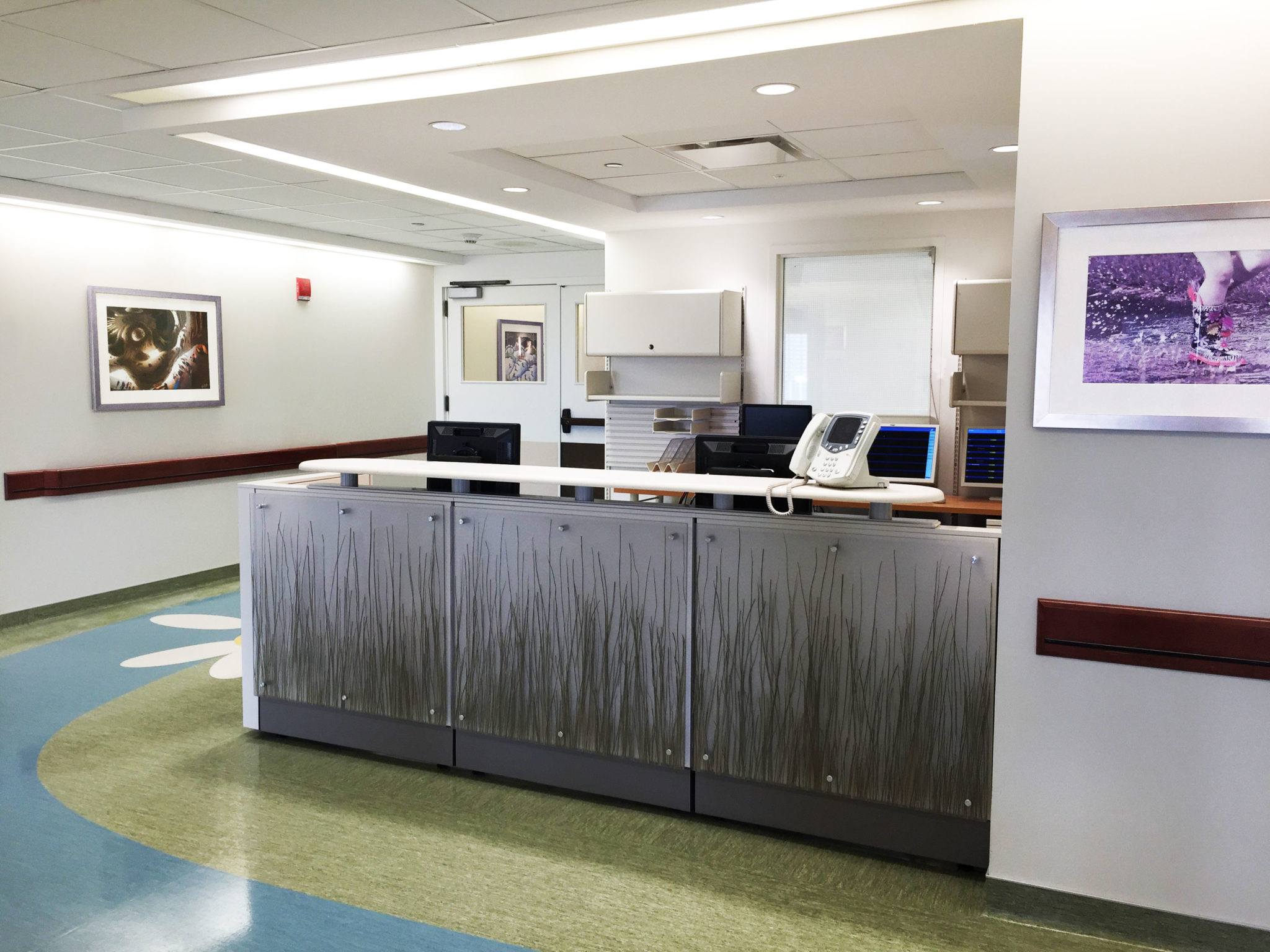
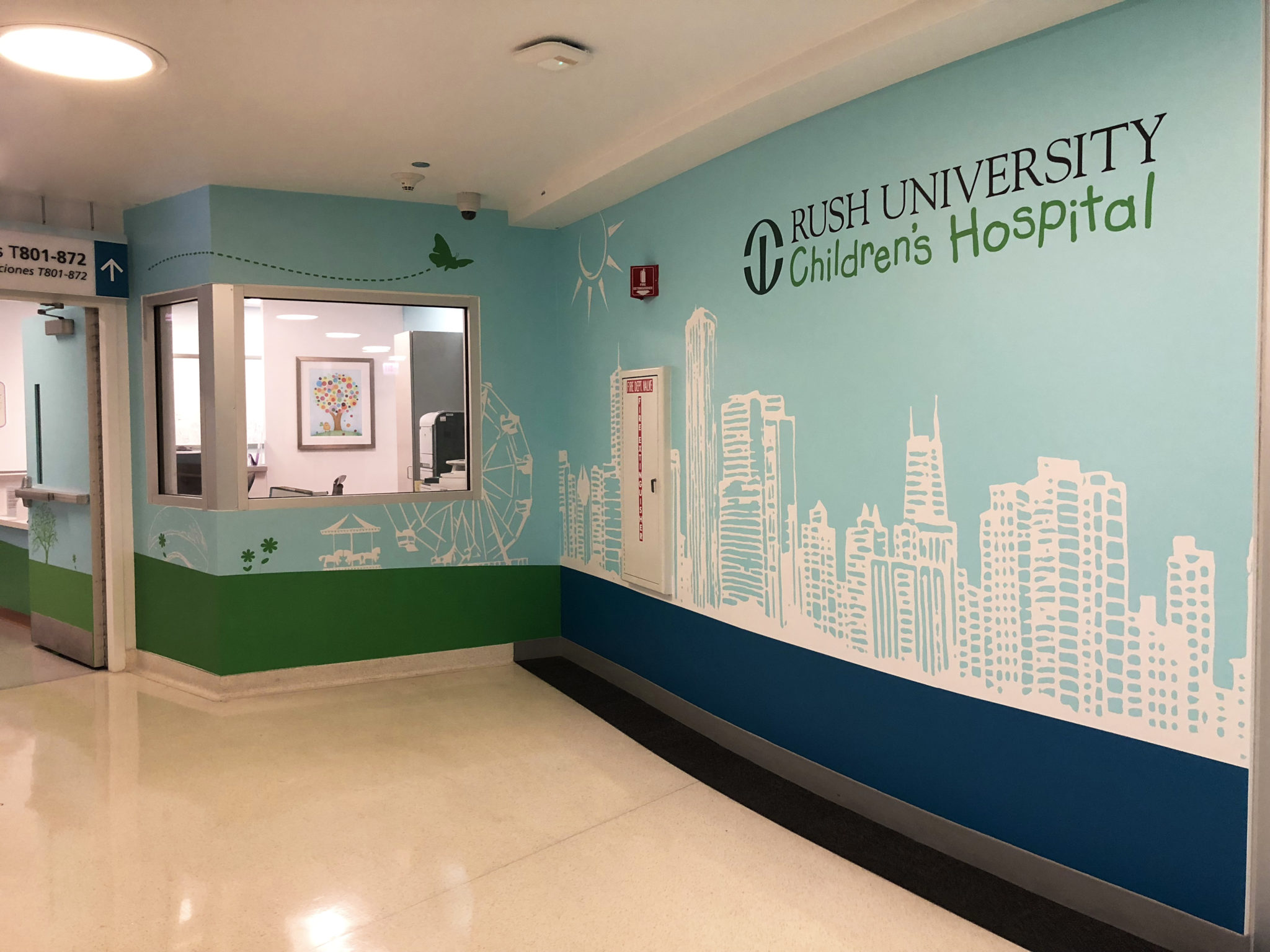
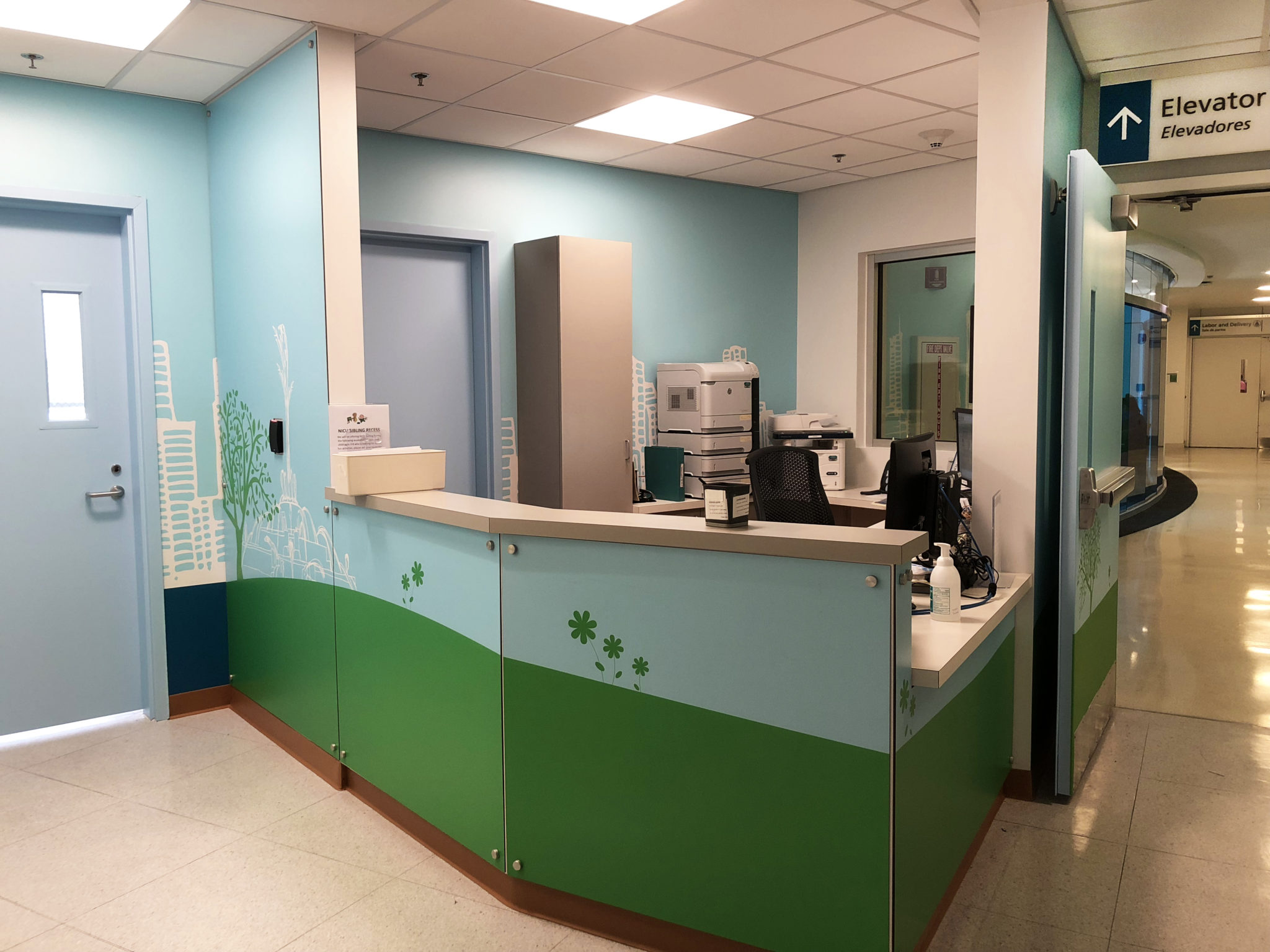
Our design concept for the PICU at Rush University Medical Center was inspired by the changing seasons of the Midwest, while also presenting an underlying Chicago theme. As you enter the unit from the main elevators you are immediately greeted by a whimsical mural of the Chicago skyline. We designed this mural as a unique wayfinding tool that also functions as a stunning piece of art.
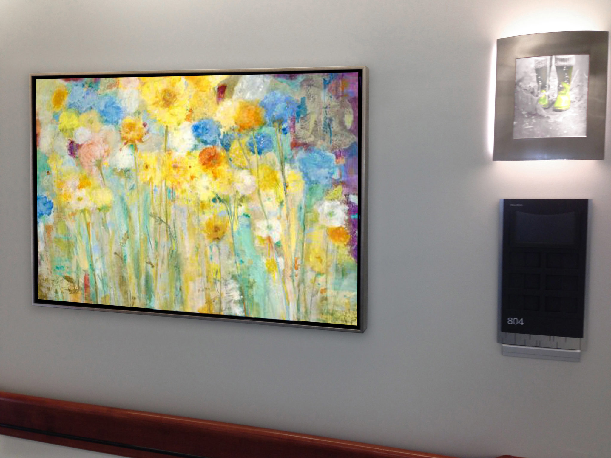
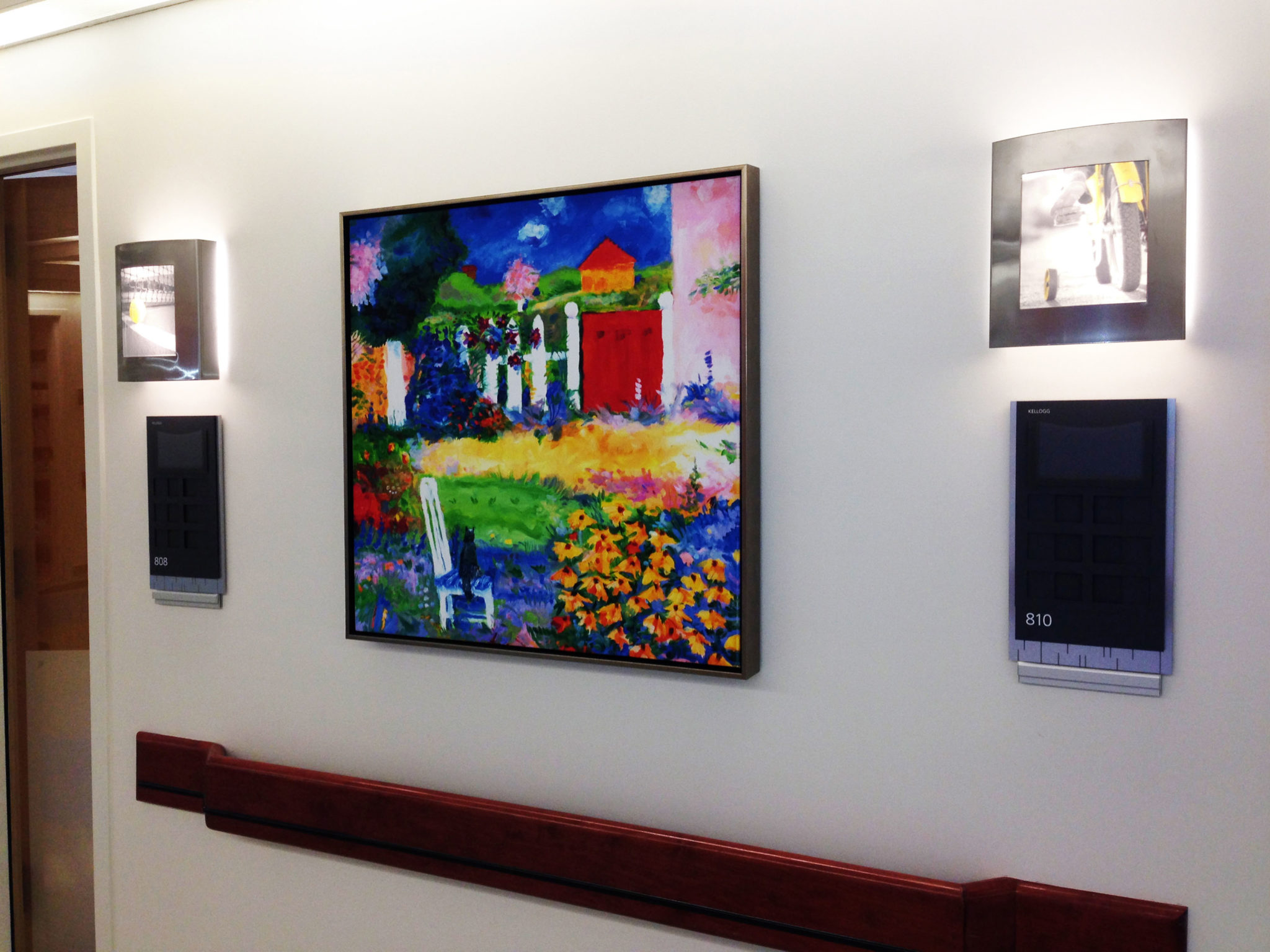
Moving through the unit you see the flooring transition to represent the changing seasons, which is also reflected in the coordinating art selections in the corridors, the imagery on the custom sconces, and patient boards assigned to each room. All of these design choices combine to create an immersive experience that is both engaging and functional for the patients and their families.
Rush Imaging
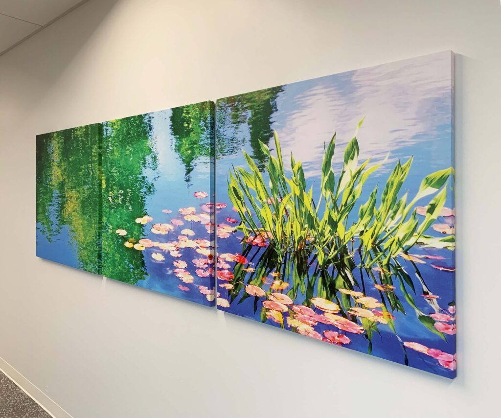
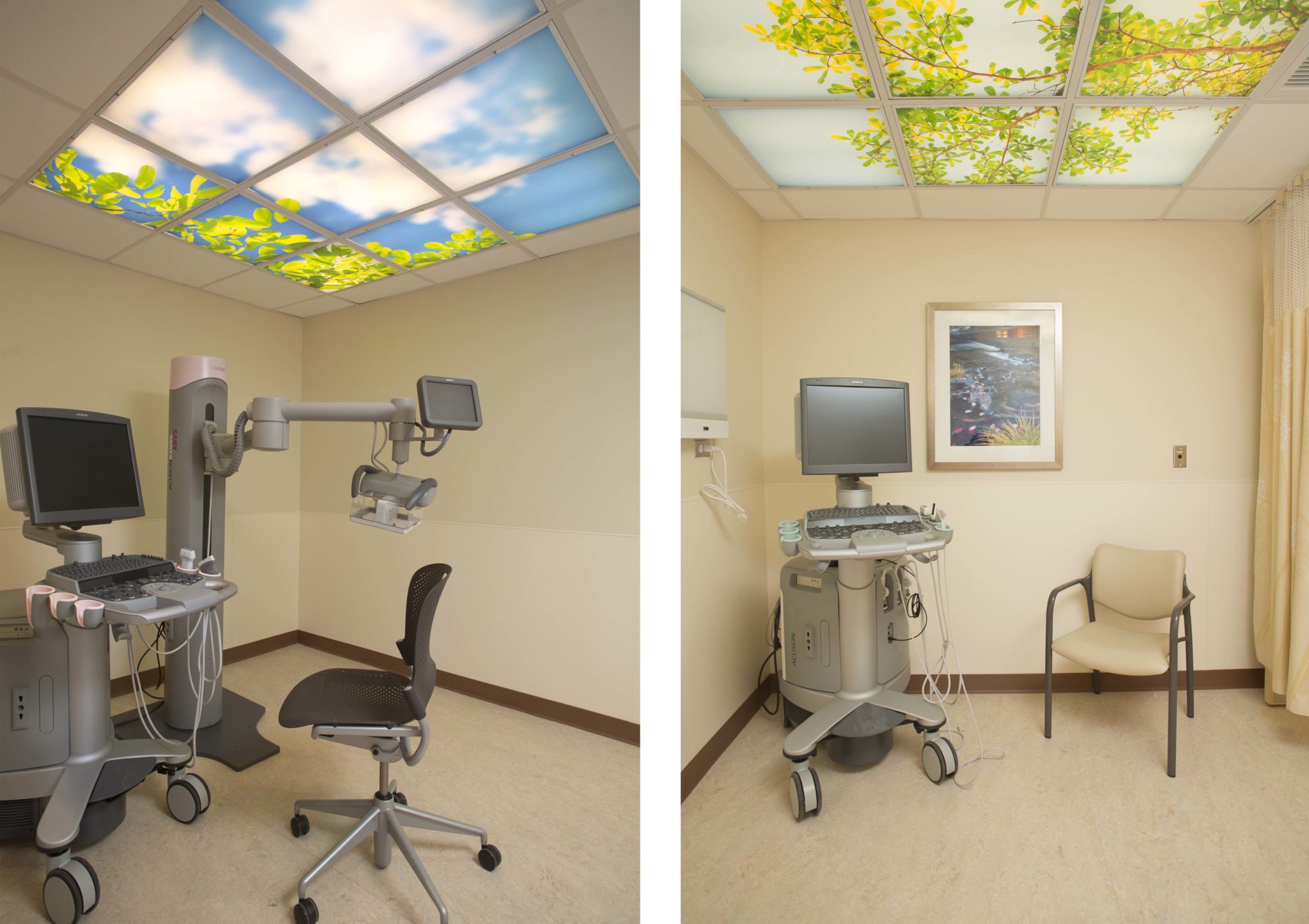
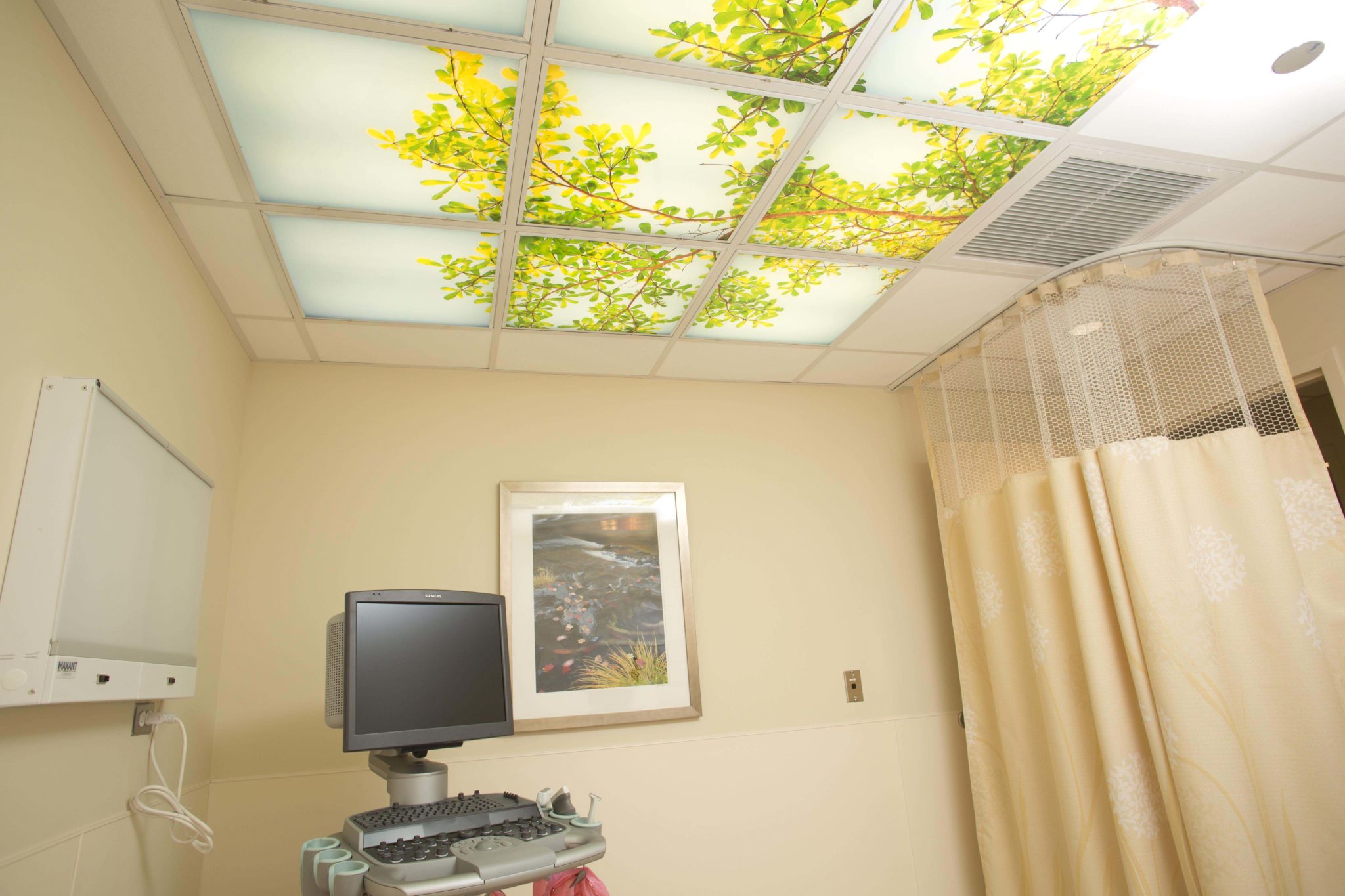
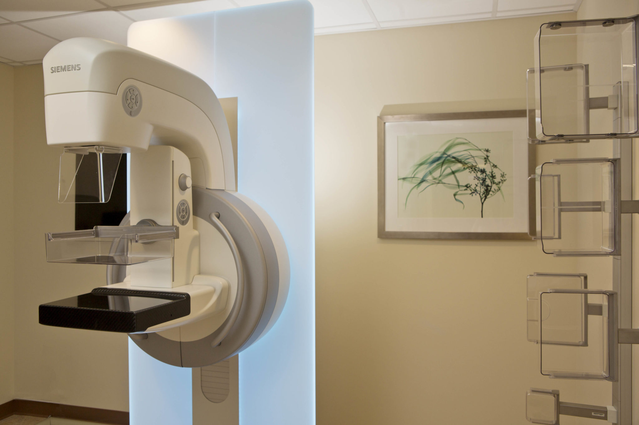
Researchers believe that viewing nature-based imagery has a genuine psycho-physiological benefit that triggers useful changes in mind and body. Our illuminated ceiling panels bring the beauty of nature indoors to the Rush Imaging department. This fusion of fine art photography and state-of-the-art technology implements what scientists have known for years: that nature promotes healing, improves productivity in the workplace, increases well-being and reduces stress in all environments.
As art consultants for the Rush Transformation, we created an environment that has the feel of a medical spa while reinforcing the Rush brand image. This approach of bringing nature inside reinforces one of the client’s core values: the desire for a comfortably designed environment. The soothing palette of the artwork complements the interior furnishings, all referring back to the rhythmic patterns of nature.
Rush River North Outpatient Center
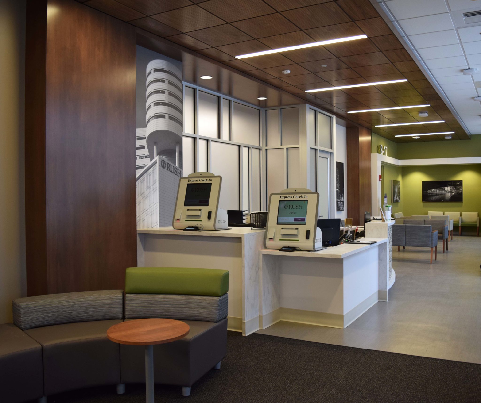
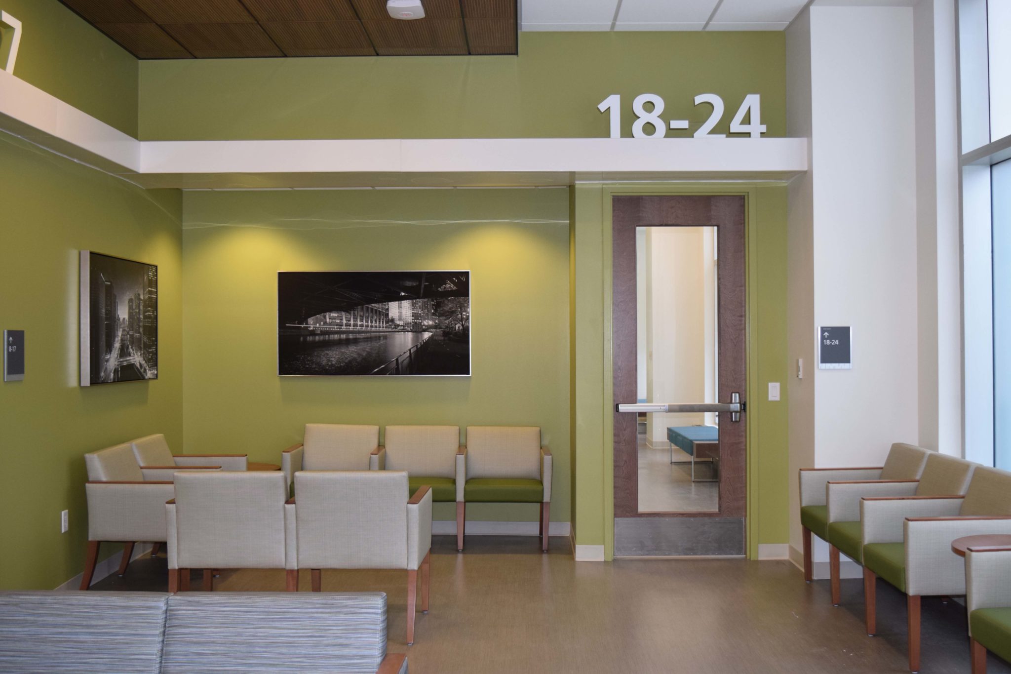
Rush River North provides high quality primary care, obstetrics-gynecologic and dermatology services, offering convenient hours and walk-in care to patients in a convenient, neighborhood setting. We were tasked with creating an attractive urban art experience while at the same time reinforcing the brand image of the main campus. We accomplished this by printing a series of iconic Chicago scenes in an artistic black and white format. The urban imagery is complemented by a large-scale wallcovering featuring a close up of Rush’s East Patient Tower printed on contract grade vinyl. Our group provided turn key services which included selection, budget development, fabrication, and installation.


